Area-to-area Poisson Kriging#
Before starting this tutorial, be sure that you have understood concepts in of ordinary kriging and semivariogram regularization.
The Poisson Kriging technique is used to model spatial count data. We analyze a particular case where values are counted over blocks, and those polygons have irregular shapes and sizes. We will predict the breast cancer rates in the Northeastern counties of the U.S. We use U.S. Census 2010 data to create point support for blocks.
In the previous tutorial Poisson Kriging - Centroid based approach, we’ve assumed that all areas have the same size and shape. It is not a valid statement. We now use the Area-to-Area Kriging technique to predict and evaluate missing values of counties with varying shapes and sizes.
Area-to-Area and Area-to-Point Poisson Kriging are slower than simplified Kriging with Centroids but give more reliable results because they are tuned to the areal size and shape.
Prerequisites#
Domain:
kriging
Poisson kriging and Poisson distribution
rates
Package:
Deconvolution()ordinary_kriging()TheoreticalVariogram()centroid_poisson_kriging()
Programming:
Python basics
pandasbasics
Table of contents#
Prepare data
Load regularized semivariogram model
Prepare data for Poisson Kriging
Filtering areas
Evaluate
1. Prepare data#
[1]:
import geopandas as gpd
import numpy as np
import pandas as pd

from tqdm import tqdm

from pyinterpolate import TheoreticalVariogram, Blocks, PointSupport, area_to_area_pk
[2]:
DATASET = '../data/blocks/cancer_data.gpkg'
OUTPUT = '../data/regularized_variogram.json'
POLYGON_LAYER = 'areas'
POPULATION_LAYER = 'points'
POP10 = 'POP10'
GEOMETRY_COL = 'geometry'
POLYGON_ID = 'FIPS'
POLYGON_VALUE = 'rate'
[3]:
blocks = Blocks(
    ds=gpd.read_file(DATASET, layer=POLYGON_LAYER),
    value_column_name=POLYGON_VALUE,
    geometry_column_name=GEOMETRY_COL,
    index_column_name=POLYGON_ID
)
[4]:
point_support = PointSupport(
    points=gpd.read_file(DATASET, layer=POPULATION_LAYER),
    blocks=blocks,
    points_value_column=POP10,
    points_geometry_column=GEOMETRY_COL,
    verbose=True
)
[5]:
blocks.ds.plot(column=blocks.value_column_name,
               cmap='Spectral_r',
               legend=True,
               figsize=(12, 8))
[5]:
<Axes: >
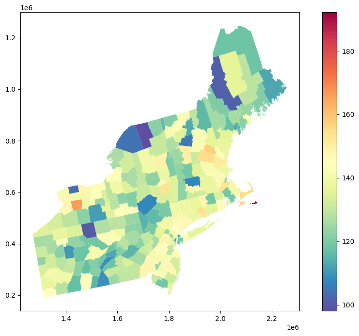
Clarification: It is always a good idea to look into the spatial patterns in dataset and to visually check if our data do not have any NaN values. We use the geopandas GeoDataFrame.plot() function with a color map that diverges regions based on the cancer incidence rates. The output map is not ideal, and it has a few unreliable results, for example:
In counties with a small population, where the ratio number of cases to population size is high even if the number of cases is low,
Counties that are very big and sparsely populated may draw more of our attention than densely populated counties,
Transitions of colors (rates) between counties may be too abrupt, even if we know that neighboring counties should have closer results.
We can overcome those problems using Area-to-area Poisson Kriging for filtering and denoising.
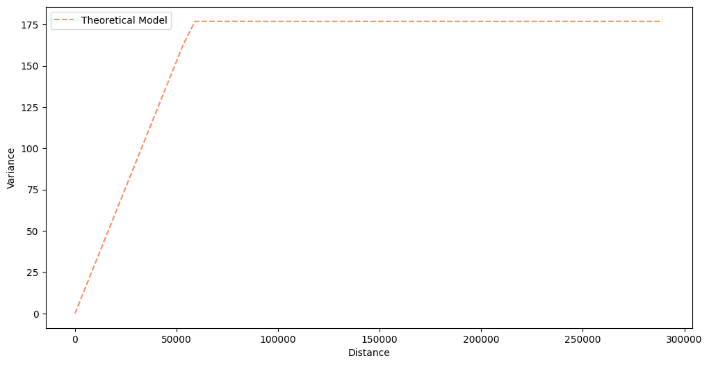
2. Load regularized semivariogram model#
We load a regularized semivariogram from the tutorial about Semivariogram Regularization. You can always perform semivariogram regularization along with the Poisson Kriging, but it is a very long process, and it is more convenient to separate those two steps.
[6]:
semivariogram = TheoreticalVariogram()
semivariogram.from_json(OUTPUT)
semivariogram.plot(experimental=False)
3. Prepare data for Poisson Kriging#
We simply select random blocks values from blocks data and try to predict those values using Poisson Kriging.
[7]:
sample_ids = blocks.ds.sample(20)['FIPS'].to_numpy()
sample_ids
[7]:
array([42107, 36075, 42041, 42027, 34003, 36001, 42093, 42057,  9009,
       25011, 23025, 36103, 34021, 42079, 36089, 36031, 33007, 42119,
       36083, 23005])
4. Filtering areas#
You may start to work with predictions with a fitted semivariogram model. Area-to-area Poisson Kriging takes five arguments during the run:
semivariogram_model: fitted semivariogram model
point_support: point support data
unknown_block_index: id of the interpolated block (
point_supportmust have this block’s point support coordinates and values)neighbors_range: how wide is neighbors search area, by default it is
semivariogram_modelrangenumber_of_neighbors: how many neighbors are used for the interpolation
The algorithm in the cell below iteratively picks one area from the test set and performs prediction. Then, forecast bias, the difference between actual and predicted value, is calculated. Forecast Bias clarifies if our algorithm predictions are too low or too high (under- or overestimation). The following parameter is the Root Mean Squared Error. This measure tells us more about outliers and huge differences between predictions and actual values. We will see it in the last part of the tutorial.
[8]:
preds = []

for b_id in tqdm(sample_ids):
    pred = area_to_area_pk(
        semivariogram_model=semivariogram,
        point_support=point_support,
        unknown_block_index=b_id,
        neighbors_range=semivariogram.rang*2,
        number_of_neighbors=8,
        raise_when_negative_error=False
    )
    preds.append(pred)
100%|██████████| 20/20 [00:04<00:00, 4.53it/s]
[9]:
results = pd.DataFrame(preds)
[10]:
results = results.merge(blocks.ds, left_on='block_id', right_on='FIPS')
[11]:
results.head()
[11]:
| block_id | zhat | sig | FIPS | rate | geometry | representative_points | lon | lat | |
|---|---|---|---|---|---|---|---|---|---|
| 0 | 42107 | 128.049947 | 9.414107 | 42107 | 115.2 | MULTIPOLYGON (((1670088.257 358635.875, 167006... | POINT (1650323.464 368750.266) | 1.650323e+06 | 368750.265783 |
| 1 | 36075 | 132.715936 | 10.441738 | 36075 | 143.5 | MULTIPOLYGON (((1581876.402 689018.858, 158200... | POINT (1591216.884 663884.599) | 1.591217e+06 | 663884.599117 |
| 2 | 42041 | 119.579583 | 8.467769 | 42041 | 130.9 | MULTIPOLYGON (((1604893.567 299745.669, 160480... | POINT (1576325.693 291564.448) | 1.576326e+06 | 291564.447617 |
| 3 | 42027 | 118.067558 | 10.056972 | 42027 | 141.4 | MULTIPOLYGON (((1495040.309 391321.809, 149503... | POINT (1513734.416 363907.622) | 1.513734e+06 | 363907.622101 |
| 4 | 34003 | 127.193763 | 6.258667 | 34003 | 140.8 | MULTIPOLYGON (((1827117.746 423012.913, 182717... | POINT (1818622.729 437071.975) | 1.818623e+06 | 437071.975383 |
5. Evaluate#
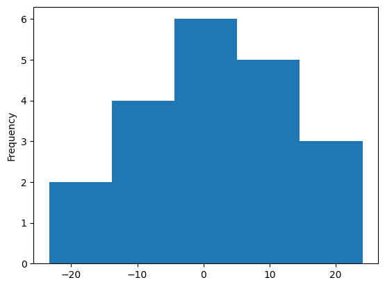
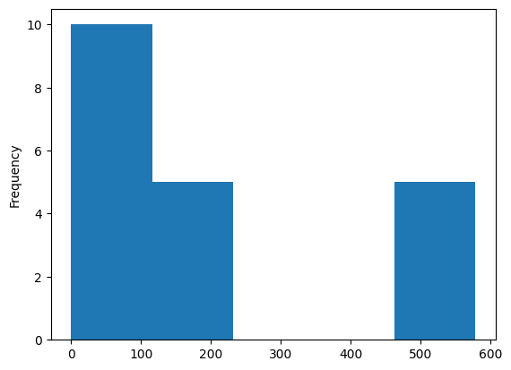
The analysis of errors is the last analysis step. We plot two histograms: forecast bias and squared error then we calculate the base statistics of a dataset.
[12]:
results['forecast_bias'] = results['zhat'] - results['rate']
results['squared_error'] = (results['rate'] - results['zhat'])**2
[13]:
results['forecast_bias'].plot(kind='hist', bins=5)
[13]:
<Axes: ylabel='Frequency'>
[14]:
results['squared_error'].plot(kind='hist', bins=5)
[14]:
<Axes: ylabel='Frequency'>
[15]:
results[['zhat', 'rate', 'forecast_bias', 'squared_error']].describe()
[15]:
| zhat | rate | forecast_bias | squared_error | |
|---|---|---|---|---|
| count | 20.000000 | 20.000000 | 20.000000 | 20.000000 |
| mean | 129.228669 | 127.830000 | 1.398669 | 179.574443 |
| std | 7.810987 | 14.454142 | 13.673569 | 215.335912 |
| min | 117.906817 | 101.100000 | -23.332442 | 0.008683 |
| 25% | 125.756270 | 115.575000 | -8.189205 | 3.405850 |
| 50% | 127.729558 | 130.700000 | 0.657993 | 99.978315 |
| 75% | 131.912100 | 138.475000 | 9.628163 | 262.877367 |
| max | 146.846616 | 152.900000 | 24.044155 | 578.121379 |
[16]:
rmse = np.sqrt(np.mean(results['squared_error']))
print(rmse)
13.400538906042224
Clarification: Analysis of Forecast Bias and Root Mean Squared Error. Their distribution and basic properties are describing model performance. However, consider that the table above is a single test case (realization) and can be misleading. The good idea is to repeat the test dozens of times with a different training/test set division each time. After this, we average results from multiple tests and get insight into our model’s behavior.
negative forecast bias: model underestimates predictions
positive forecast bias: model overestimates predictions
forecast bias close to 0: model is (probably) accurate
root mean squared error: accuracy measure, large rmse means that model performs poorly or we have many outliers
Note 1: Those results are not decisive. Our sample has been selected randomly, and there is a chance that it is not a spatially representative sample! (E.g., areas only from one region). The good idea is to repeat the experiment multiple times with other samples and average results to determine how well the model performs.
Note 2: If we analyze errors’ statistics, we should consider not only error’s mean value. Let’s look at different pieces of information:
Histograms clearly show us how dispersed and grouped errors are, and most importantly, we directly see the worst predictions and how many of them are generated by our model.
What is plotted on a histogram is described by statistics. We may check the max and the min error, but the true power comes when we analyze quartiles and standard deviation.
The standard deviation is a good measurement of our model’s variance; lower standard deviation of errors, the better.
Sometimes, we must look into quartiles. A very high mean but relatively low median (or even the 3rd quartile) indicates that we have only a few wrong predictions (that could be interesting, because it means that few locations are heavily under- or over-estimated).
Note 3: Root Mean Squared Error from Area-to-Area Poisson Kriging should be lower than RMSE from Centroid-based Poisson Kriging because predictions are more smoothed by the fact that ATA takes into account population distribution within an area.
Changelog#
Date |
Changes |
Author |
|---|---|---|
2025-05-30 |
Tutorial has been adapted to the 1.0 release |
@SimonMolinsky (Szymon Moliński) |